Tuesday 25 November 2014

Reflection 10 (most eye-opening regarding ethical approaches to COPYWRITING)

Reflection


Week 12

As we all know, one of the main goals in copy writing is to persuade. A good copywriter has the ability to influence people’s buying decision by using words. It is no a difficult task for a professional copywriter to persuade. However, it is a different story when it comes to persuade ethically. One of the most eye opening ethical approach for copywriting is to understand the meaning between ethical selling and sleazy selling. There is a fine line between the two, ethical selling is to persuade people into buying something they need whereas sleazy selling does not consider whether the audiences can afford or need your product or not. The goal is to just sell, to gain profit. Although it is not wrong to do so, yet it is not what an ethical copy writer is suppose to do.
The rule of thumb is to always tell the truth. A good copywriter should always tell the truth, the real truth no the misleading truth. What does misleading truth mean? It means not telling the entire features but hiding some of the truths. Although you may not lie, it still considered as unethical if you hide some of the facts from your customers. In fact, a good copywriter should always put the buyers’ needs first, by persuading people into buying things only if it benefits them. A good ethical copywriter should always put the true benefit of products at the back of their mind, and not the income. A successful copywriter is determined by the satisfaction of the customers and not the amount of money they earn.


Signing off : Lau Ko Yin 0308565

Print Avertisement 2(one medical or hygiene product, and the other -children's ad)

Week 12

Post 2

The print ad shown above is about child abuse. This print ad is showing that the child get abuse by people nowadays. People nowadays are very rude to the children and did not give respect to them, it is an unethical issue. This print ad is created and helps to solve this problem to the child. As for the headline, he gets his looks from his father. This headline was stating they got the look from his parents and they did nothing wrong. As you can see, there is a contact number to contact whenever children get abuse because is to stop children being bully or abuse by people. The headline, to me is quite interesting so it catches audience's attention easily. However, This print ad do not have body text because the headline is already very clear to send the message to the audience out there. Not only that, the visual that they are using is a children and injury on his face which is means the child get abuse or bully by people out there. Nevertheless, the face expression of the child looks very sad, which tells the audience to stop bully. However, this print ad helps to stop people out there who is still bullying other children.

Signing off by : Yap Shi Ying

Print Avertisement 1(one medical or hygiene product, and the other -children's ad)

Week 12

Post 1


The print ad shown above is about a body hygiene product for underarm called Rexona. Rexona helps to cure underarm smell and whitening cleanness for the underam because underarm smell is an unexpected serious habit and it creates rudeness to people around you, it is an unethical habit. So that, Rexona is created and helps to solve this problem for this print ad. As for the headline, use rexona women every after bath. Nothing keeps you drier every day. This headline was stating the method of using rexona, the effect of rexona and it targets women audience. The proper way of using rexona was use it every time when they finish bath, just roll on their underarm and it will feel fresh, smells good and comfort. It will maintain for long hours and nothing keeps them drier. The headline was interesting and sounds convincing so it definitely grab audience’s attention. Furthermore, this print ad does not have body text because they want to deliver the message through headline and visual. The visual they are using is a woman using rexona after bath in the bathroom. The face expression of the woman tells the audience that it is fresh and comfort after using it, so it brings confidence to individual. This print ad helps to boost ethical approach in society as underarm smell was really irritating and build rudeness to people around you. So that, this print ad also deliver ethical behavior to the audience as they think is good and they will purchase it.

Signing off by : Chan Chi Rap 0306431  

Saturday 15 November 2014

Reflection 9 (Good Press Release)

Reflection

Week 11

Press releases do not just keep the media and the indutry informed of your company's recen

developemen, they do more than that. They are meant to get the journalist seek to cover the topic

further or more detail. In order to write a good press release that will get published by editors,

there ae a few tips in writing a good press release. First of all, which is to grab the attention by

having a good headline. A strong headline will pull and grab attention of journalist seeking good

stories. Be straight forward in the first paragraph by getting to the right point by puting the main

point of the article or press release in the first sentence and other supporing points later on.

Besides that, numbers should be included as a proof in order to support your article that are

claiming something base on research. A press release should be gramatically flawless because a

singlemistake can dissuade a reporter from taking you seriously. Furthermore, quotes and

citations can be included when there is space. By including a good quote from someone in the

company or close to the product or event can give a human element to the press release, as well

as being a ource of information on its own.

Your contact information should always be included because a common element that can render

a press release ineffectual is a lack of contact information for reporters to follow up with. When

writing a good press release, the number of pages is very important. It is best and adviced to keep

it to one page and two pages is the maximum. Lastly, providing access to more information and

relevant links to your company's website, where writers can learn more about your mission as this

is a very crucial element to the press release. Do not make writers search on their own for extra


information but guide them as quickly as possible.

Signing off by : Lim Sze Young 0319254

Best advocacy or image/ corporate advertising advertisement 2

Week 11

Post 2

Advocacy advertising promotes the view point of the company’s outlook on various issues, simply put, it is to generate sales by promoting an opinion. However, most advocacy ads are non-commercialize.
The ad I haven chosen is a “pro-life” advocacy advertisement. I find this ad outstanding as the visuals and headline has the ability to draw my attention, even though the visuals are entirely black and white. The ad cleverly uses different size of fonts, manipulating the boldness and size of typography to deliver the main argument of the ad.
In addition, because of how simple the color choice is, and the boldness and size difference of the words and images, this poster has a very serious nature, making it have some effect on the audience.
Also, this ad is obviously targeted at Americans, and by critiquing the Americans so straight forwardly, it is quite a good motivator to make the Americans more aware of the issue.

On the downside, although this ad effectively delivers the message, it did not state any details about the organization behind the campaign. There are no Call-to-action as well. All in all, I think this is an effectively advocacy ad as it has a good headline, a good argument. Yet, marketing wise, it is a bad ad as it did not have sufficient details about the company or organization.

Signing Off : Lau Ko Yin 0308565


Wednesday 12 November 2014

Best advocacy or image/ corporate advertising advertisement 1

Week 11

Post 1


This ad was advertise by an organization called HealthStrategiesGroup. Market research is worthless. Until it’s transformed into knowledge that works for you. The headline and tagline from the ad is extremely effective to those market researcher learner. Therefore, from this statement, if you do market research blindly is totally useless unless it becomes a knowledge that means market researcher needs to make use of the knowledge for market research because it will become worthless by wasting a lot of time doing market research. The message delivered was to inform market researcher to be smart of using knowledge. According to the body copy of paragraph 1, people do market research to find a solution on market business decisions but market research is totally worthless when people sift to find meaning for their brand because just seek for the meaning is not enough at all by just getting nothing. Market research should transform into knowledge along with forming strategies to equip for market researcher then it will become extremely effective for market researcher to achieve their specific business goals. Next body copy paragraph 2, the message delivered by the organization was to provide benefits to market researcher, it helps market researcher to transform research results into the practical knowledge and strategic recommendations that work for market researcher which is very effectively prize by requesting their help because market research is very effective once convert to strategy. Lastly, the organization provide a call to action by stating the number of their organization which pull market research to find them.

Signing off by : Chan Chi Rap 0306431

Saturday 8 November 2014

Reflection 8 (How to create an engaging and successful fundraising letter?)

Reflection

Week 10

Firstly, the letter begins considering both your audience and your specific plans. What will appeal to your readers? What might make them really feel the urgency of your request? Why does your cause touch their heart?

Consider inserts or add elements to your letter to help to show your readers what will your organization do and how important it is. Show pictures of those who are helped by your organization, make it clear how it improves lives. Also consider inserts such as a copy of a new article about your cause, reminding the readers what you have done recently.

You can also share stories of how your organization has helped people, the situations you have seen that caused you want to help. Tell a story about success to inspire, and describe what you saw when you came to help. Make the story inspiring, engaging and exciting to create interest for the readers.
The letter makes it clear, that there can be a real emotional value to giving to those in need and reinforce the feeling of appreciation. Readers want to know why and they can become emotionally as well.

Consider news headlines into your fundraising campaign to catch the reader’s attention. Using the headline they drew immediate attention, consider using a headline that refers to popular media or recent news to quickly draw attention and understanding from your readers.
Thank you letters should addressed by name to the individual. Remind readers that they are valuable people, not just names on bulk mail list.


Signing off by : Chin Yuli 0318573

Interesting Flyers/ Brochure/ Catalogue 2

Week 10

Post 2


The photo is actually a flyer or pamphlet from Coca-Cola. It is a very uniquely design and also keep simple by using the shape of a Coca-Cola can. The flyer shows the history of Coca-Cola and also how much and how big is the company in the world. As normally flyers are very wordy with all the information packed in a piece of paper including the price and also the USP of the product, this one, the design and marketing strategy is somehow different as it contains mainly the history of the company and also telling people the calculations and studies that shows how many people in the world is consuming Coca-Cola, the headline which is "Coke Is It!" is actually trying to tell readers why you should choose Coca-Cola over any other soft drink which is explained at the bottom part of the body copy which also is trying to create an interactivity with readers by telling them the history of the company. The writing style of the ad is very unique in a way that there is no images in the ad but only words which can get the attention of readers, but sometimes it might not work as well as some people do not really like to read. The features and also the benefits of the Coca-Cola is explained at the bottom part of the body which states that Coca-Cola is "delicious and refreshing! There's nothing else that taste like a can of Coca-Cola" which clearly explain the USP that it is a very unique soft drink to readers.


Signing off: Lim Sze Young 0319254

Interesting Flyers/ Brochure / Catalogue 1

Week 10

Post 1


The photo above is a photo of a brochure that BMW mails directly to their target audiences. This is a very interesting brochure not only due to its unusual design; also because of it’s interactivity with the receivers. A normal brochure is usually a 2 or 3 folds brochure that contains very detailed information about the product or services. However, a normal brochure like that tends to bore people and people might not be interested in it. Therefore, interactivity is an important element is a good brochure. In this BMW brochure, it interacts with the receiver by having them to tear off the strip to open up the envelope. The action of tearing up the strip symbolizes the BMW car driving and cutting through snow. The white background represents snow and the headline on the cover helps us to understand the USP. However, some people may not understand the USP by looking at the headline on the cover. Yet, they will still open up the envelop due to curiosity and the tagline in the envelope will explains it all. The direct tagline “BMW COLD WEATHER TIRES” will immediately explains the USP of the whole brochure. Overall, this brochure contains a teaser headline that grabs people’s attention, a direct headline that shows its USP, a short body copy that does not require receiver to read a lot, instead they attached a 1 page catalogue that shows all the product types and with short descriptions. In addition, its simple and minimal design and layout is indeed another bonus for this good brochure!

Signing off: Lau Ko Yin 0308565

Saturday 1 November 2014

Reflection 7 (Interesting New Media Advertisement)

Reflection

Week 9

To create a new media advertisement on the social media, the first thing that have to be considered is that what kind of social media that will used by most of the people. Example, the most popular social media that used by most of the people nowadays are Facebook and Instagram. As well as even we are creating a banner advertisement, we have to considerate that the route was used by most of the people. The most important element that have to be considerate is that the visual must be attractive, and able to attract the sight of the audience. The colours that been used to create the advertisement must be striking and able to create a powerful imagination to the audiences. Besides that, the text of the advertisement also important, because it also can be used to be an element to attract the sight of the audiences.
There are 3 tips to create an engaging media, first is the image play an important role, image is to attract the sight of audiences. Second, easy-to-read text, this is one of the element in an advertisement is because, the audiences will only read the advertisement when it’s easy to read. Lastly, a simple colour scheme, if an advertisement is too colourful, the audiences will tends to ignore the advertisement.

Besides that, posting the advertisement consistency is a very important act, is because if we doesn’t post the advertisement consistent, the people who are using the social media will forgotten the page of the company.

Signing Off by : Low Zhi Hui 0314910

Interesting New Media Advertisement 2

Week 9

Post 2

Nivea - Banner Ad
In a banner ad, everything is important in order to capture the attention of viewers. As for Nivea's banner ad which is about age reverse, which means reversing your age to a younger you. As seen in the ad, there's only these words "Nivea Age Reverse" and also a product from Nivea in the middle of the banner ad with designs looking like a clock. The interactivity of the ad shows that the clocks is moving counter-clockwise instead of clockwise like how a normal clock really moves. It is trying to tell viewers that by using the product from Nivea, you an turn your looks to a younger and better looking you by protecting and preserving your beauty and looks.
The writing style of the banner ad created by Nivea is very simple yet easy to understand, there is no need to be wordy as the graphic designs and also the short tagline "Nivea Age Reverse" has explained everything what Nivea wants to tell to viewers.
Besides that, the ad didn't really show their benefits in words, but in graphics, they have explained it all by showing the cunter-clockwise movement of the clock and in the middle is the product from Nivea, which is trying to tell viewers that by using their product, they will look younger and will not get old.
 Signing off by : Lim Sze Young 0319254

Friday 31 October 2014

Interesting New Media Advertisement 1

Week 9

Post 1


Digi Banner Ad

To create a banner ad, the first thing the ad must have is the headline. The top part of the ad must have headline to let people know what the ad is trying to deliver. The DIGI banner ad headline it stated “enjoy your favorite videos with out-of-this-world clarity on the Samsung Galaxy Note 4”. It means they want us to enjoy watching our favorite videos in a clear quality by using the new Samsung Galaxy Note 4. They use interesting words.
For the interactivity, a banner ad must also interact with users. The ad not only needs to grab attention but also interact with them. The message that they trying to convey towards the users must interact with users so users can understand the ad.
The writing style in the ad it is short and simple and also uses interesting words that can grab people’s attention. The writing style must keep it simple and with strong copy, the less the better for people to read because they do not have time.

The ad also stated the benefits, it stated “get yours now with DG SmartPlan, for the most complete internet experience”. Digi is a telecommunication company so it stated their benefits about their DG SmartPlan, the benefits are they want the users using the DG SmartPlan will experience the most internet experience. They also stated the call to action “get yours now”, they want to encourage the users by getting the DG SmartPlan now. It uses meaningful message instead of a boring click button. 

Signing Off by : Chin Yuli 0318573

Monday 20 October 2014

Reflection 6 (Best TV Commercial)

Reflection

Week 8


Considerations for making a good broadcast ad or radio ad is a must. For TV ads. First, put people in your commercial. People relate to other people. Putting people into your commercial can help draw your target audience in as opposed for interior or exterior of the environment. Have them doing something that relates to your business. Next, plan out your video. It’s crucial you not cram a bunch of video into the small amount of time you have for your commercial. Your video should tell the story about what you are advertising even if a customer has their volume turned down. Writing the script is also important that do not extend too long.  Use short sentences that grab your potential customer's attention. You've got a very limited time frame to capture your audience and you need to get your message across quickly. Don't get wrapped up in long sentences. Keep them short and punchy. As for the radio, message should be in convincing tone with several effective delivery of message. Make sure even for tv or radio ads, audio and video must control carefully to perform creatively. Lastly, both radio and tv ad should include call to action delivery message to grab audience reverse responds.


Signing off by : Yap Shi Ying 0306133

Saturday 18 October 2014

Best TV Commercials 2

Week 8

Post 2


Snickers bar TV Commercial

The TV commercial is about Snickers chocolate bar. It uses celebrity Mr.Bean in the commercial as we all know he is a famous comedian, it can grab consumer’s attention easily. A commercial must open strong to capture consumer’s attention.
A commercial must have creativity. In this commercial they use Mr.Bean that is entertaining. It showed Mr.Bean clumsily tries to keep up with group of Chinese warriors as they fly from one rooftop to another. When he crashes through a roof and fell down, he was surrounded by a group of enemy warriors, the group of Chinese warriors gives him a Snickers bar. After taking a bite, he transforms into a warrior and flies out from the roof.
The commercial it showed the benefit after grabbing a bite of Snickers you will become stronger. The slogan “You Are Not You When You’re Hungry” is when guys get hungry, theyre off their game and Snickers is the bar of substance that can sort them out. They display the product when Mr.Bean grabs a bite and the ending they showed the product close up. They also mentioned the slogan during the ending to make consumers remember.
To create a good commercial it must be memorable and effective. If the start of the commercial are not effective it consider as fail.

Signing off by : Chin Yuli 0318573


Best TV Commercials 1

Week 8

Post 1

http://www.youtube.com/watch?v=ZelqaUQ8q80

This Mercedes Benz SLS AMG is the best commercial that I have ever seen. This advertisement brings out that all the elements of the car. It shows that this car is powerful enough to flip in the tunnel.

A good commercial advertisement must able attract the audience, for example, this commercial ad produced a very good effect and it did attract the audience by showing how powerful the car is. On the other hand, this ad had used Michael Schumacher as the actor of this commercial. The fame of Michael Schumacher is that most of the people around the world knows about him and they will watch the ad because of him. Besides that, in this ad it also shows that how elegant the car it, to attract the people to look at the ad. A commercial must add in the elements of a product, benefits and functions of the product. 

Signing off by : Low Zhi Hui  0314910

Saturday 11 October 2014

Reflection 5 (Writing Styles and Layout)

Reflection

Week 7

Writing is a craft. Skilled writers incorporate stylistic techniques into their writing for rhetorical effect. In other words, stylistic techniques enhance a piece of writing’s aesthetic, emotional or intellectual appeal. Certainly, the content of a text is important, but a writer who can organize his ideas in a unique and provocative way can increase his writing’s allure(Smith,2010). What I learn for the writing with style was that in an advertisement, there’s technique in writing the body copy in a convincing and desirable tone due to the use of style in order to grab audience’s attentions. The new writing style that I have explored is that writers can use their imaginations to express ideas through figurative devices. Figurative devices, such as metaphor, simile, irony and hyperbole, make unusual comparisons for dramatic effect. For example, a political advertisement that reads “The current leader is gouging you with taxes” utilizes both metaphor -- unusual comparison -- and hyperbole -- exaggeration -- by comparing taxation to excessive digging. In conclusion, for creative writers, there’s a limit in terms of stylistic writing techniques. They even use different style. A technique that involves interspersing dialogues or thoughts of two different people. Hence, writing with style is very effective in an advertisement.


Signing off by: Chan Chi Rap 0306431

Interesting Writing Styles and Layout Advertisement 2

Week 7

Post 2


This print advertisement is about the BMW advertisement. The layout and the style that been used suit the theme of the advertisement because the woman in the ad will attract man’s attention and most probably man will interested in BMW car, that is why the color been used is not really dull, a little bit of bright color just to easily get man’s attention in using that color. The style that this advertisement been used is woman portray to attract the attention of the man, telling the man that they are not the first. All the man would like to challenge something to get first, so it used this statement “you know you’re not the first” to make it more interesting.
On the other hand, they also used a mixture of another short sentence, which is “but do you really care” just to get the attention of the men out there. 


Signing off by : Yap Shi Ying

Tuesday 7 October 2014

Interesting Writing Styles and Layout Advertisement 1

Week 7

Post 1


This print advertisement basically is about stop the abortion. The layout and the style that been used suit the theme of the advertisement. It is because abortion is about the darkness of killing a baby, that is why the color been used is grey and white. Besides that, this advertisement has a distinct voice of style, it is telling us that we must help to speak up the pain of the abortion; the style been used that a baby was holding on a hand and placed on the middle of the advertisement is to attract the attention of the audiences, telling the audiences that how small is a baby’s life, we shouldn’t do abortion we should stop it. The baby is too small, they couldn’t voice out the pain of it, but we could.

On the other hand, it also used alliteration as like “Speak up” and “Stop the War on Children”. Next, they also used a mixture of a long and short sentence, the long sentences contains of telling us to stop abortion because the children feels the pain and also the address to get the contact to speak up the abortion.

Signing off by : Low Zhi Hui 0314910

Saturday 4 October 2014

Reflection 4 (Bad/Uneffective Body Copy)

Week 6

Reflection

Reflection: Discuss five points about bad/ uneffective body copy and layout of a print ad.

A body copy is an essential part of any print ad, it is basically the main message of an ad. Most often the real message of an ad is in the body copy. Hence, it is vital to create an body copy which is effective. There are certain rules to follow in order to write an good body copy and here are some things to avoid when writing a body copy.

1. Fancy unreadable fonts.
An effective print ad should not use any fancy fonts especially when it is difficult on the eyes. Readers would not bother to read on if the fonts are difficult to be distinguish. An effective body copy must lead readers to read every word on it, therefore serif or san serif fonts are most appropriate for a good body copy.

2. Selling too hard on the product.
A good body copy should emphasize on selling the message rather than the product itself. It's purpose should be centered to enlighten, explain readers about the benefits they can possibly gain from the product.

3. Layout out of balance
An effective ad should always follow the layout hierarchy. An ad with no or small headlines, poor image selection, image clutter and etc is absolutely a big turn off for readers.

4. Lengthy and bombastic words.
Always use short, simple and common words in the body copy.

5. Cliches
Last but not least, cliches are also a turn off for readers. A good print ad should not be too expectable.


Signing off : KoYin Lau 0308565

Friday 3 October 2014

Effective Advertisement concept (AIDCA) 2

Week 6

Post 2


This advertisement is about a person who likes to drink and drive and it interprets the message for the drivers do not drink and drive it causes you dead or maybe it causes other people dead.

Attention: As for the statement in the print ad which is “Stop the violence, don’t drink and drive.” The DON’T DRINK AND DRIVE words highlighted in red color just to grabs the attention of the audience because accident seems is a serious issue. And the visual image shows that audiences who drink and drive will cause an accident because it is dangerous.
Interest: It inspires interest for those who like to drink and drive and wanted to quit to makes a change.

Desire: This advertisement is for drivers who desire to stop drink and drive and it deliver the messages should desire the drivers to get start about it.

Credibility: As the messages are send in strong words that causing dead issue, drivers who drink and drive get convince in order to change their mind to quit this habit.

Action: Last message stated that DON’T DRINK AND DRIVE. The word is call to action message sent to audiences in order to don’t drink and drive to prevent any accident or killing issues.

Signing off by : Yap Shi Ying 0306133


Thursday 2 October 2014

Effective Advertisement concept (AIDCA) 1

Week 6

Post 1


This advertisement is basically about smoking and it stated the message for audience to harm and think that smoking can harm everybody even causes dead.
Attention: As for the headline (NO MORE KILLING), the KILLING words highlighted in red grabs the attention of the audience because killing seems is a serious issue. Also, the body copy stated that every person dies 8 seconds from smoking means that smoking really cause a serious matter for society and it produces harm and terrific to the audience who smoking. The last message was STOP SMOKING NOW! as in a form of call to action messages to deliver to audience to stop smoking.

Interest: It inspires interest for those who are still smoking and wanted to quit so the messages should hit them critically.

Desire: This advertisement is for audience who desire to quit smoking and the messages should desire the audience to get start about it.

Credibility: As the messages are deliver credibility due to the harm and strong words that causing dead issue, audiences get convince in order to change their mind.

Action: Last message stated that STOP SMOKING NOW! Call to action message sent to audience in order to take action and stop smoking to prevent health problem and dead.

Signing off by: Chan Chi Rap 0306431

Sunday 28 September 2014

Reflection 3 (Best Body Copy)

Week 5

Reflection


The five considerations in writing an effective body copy.
1. Always start the body copy with a clear and concise detail about the product like what is it and how it is used. The body copy should also include text that show how is this product more beneficial than any other similar products, a rough idea of the products price and also details of which type of consumer can make use of this product and improve their lives.
2. Using words that sound active and not dull or boring in order to engage your consumers or target audience.
3. Show feedbacks and testimonials from consumers and also experts to make your ad more credible, effective and persuasive.
4. Use simple languages such as how we communicate with our friends and families daily.
5. Use columns because some studies have shown and proven that people's eyes get tired when they are reading long lines of text and they will have a had time getting from one line to another without accidentally reading the same line or skipping a line. Therefore, use columns to make it more appealing and easier for your target audiences to read.


Signing off by : Lim Sze Young 0319254

Friday 26 September 2014

Best Body Copy Of a Print Advertisement 2

Week 5

Post 2


Daihatsu MPV
I find this print ad interesting as it made me laughed at it for a bit. This is an ad for Daihatsu's MPV which is cheap and also ordinary looking. The approach that is used on this ad is to compare this humble vehicle to a prestige luxury car - Lamborghini. Despite being out of its league, this approach has a positive effect which is being humorous and hence grabbing readers' attention with it.

Headline: Obviously the headline is the core of this ad as it is emphasized with big fonts which have taken up two thirds of the space. The headline "Picks up five times more women than a Lamborghini" itself is very eye-catching, straightforward yet making readers want to know more about the subject. Hence, continue reading the body copy.

The body copy consists of all the benefits that the vehicle offers. However it is presented in a humorous way as well. The body copy is quite engaging to the readers. For example, it says "don't laugh" after the sentence where it brags about the product. It's overall idea is to compare with Lamborghini and convincing people to not waste that kind of money to buy a luxury car.

This ad has fulfilled the requirement of a good body copy as it has also included the "call-to-action" for readers. As for the layout, it is clear, concise and clean. Without any clutter, I find this particular ad effective and very pleasant to see.

Signing off : Koyin Lau 0308565

Thursday 25 September 2014

Best Body Copy Of a Print Advertisement 1

Week 5

Post 1


Go Beyond
So far this print ad is seen the best for me and it is very interesting for me due to the content or the topic of the ad. This ad is about a mountain climbing challenges that in together with services to strengthen individual’s life experience.

Headline: The headline is interest me because GO BEYOND seems in the meaning of reaching our own limits and over performance or surpass ourselves.

Introductory Paragraph: it is interesting because the body paragraph stated the tone of convincing, sentences of the point features that keep enhancing adventurers. No experience necessary means it does not need any experience to try this challenge, just try.

Benefits or USP: the benefits interest me because this challenge provides us adventures experience, change the sense of ourselves, and the bravery will last longer for us.

Call to action: after the ad present all about the features of the ad. The ad’s form of call to action is stated in below such as the contact number of the company and the website of the organization.
Format/type: Format was interesting due to the presentation of the print ad words and the visual enhancing the motivation for adventurers. Alignment was good, clever with font size and arrangement.

Sign off by : Chan Chi Rap  0306431

Friday 12 September 2014

Reflection 2 (Creative Strategy)

Week 3

Reflection


The considerations taken to create a good ad strategy are customer, product and competitor. To create a good ad strategy you need to know who your target market is. For an advertiser they need to know to whom they are going to target their ads. They need to look at multiple aspects of target market such as the demographic, psychographic and geographic. Besides that, advertisers must also keep up with the trends around their target market, if they don’t understand their brands environment their advertising will not be on trend and will not target to the right customer.
As for the product they need to describe the product what it does and also the product benefits, how it benefits the customers. If it is good then it will persuade them to buy it. They must know how to make the customer feel comfortable after buying your product.

For the competitor, it is very important to know who your competitors are. Check out their ads and compare it. You can interview the customers to find out why they like the competitors, and find out the competitors weakness. By knowing they have these weaknesses, from there you can improve your product.  

Sign off by : Chin Yuli   0318573

Creative Strategy Advertisement 2

Week 3

Post 2


Media: Print ad
Title: Yo Sushi
Sponsor: Producer
Prospects: The target audiences will be sushi lovers who likes fresh sushi done or prepared upon order instead of bring prepared before to maintain the freshness.
Product: The freshness of the sushi that Yo Sushi is selling.
Problem: The problem is that some consumers do not understand what does the ad says. The visual of the ad catches attention but not everyone understands what the ad is trying to sell.
Objective: The point of creating this ad is to sell the food quality that is provided by Yo Sushi as like in the visual of the ad, the clean cut of the salmon with sushi rice and also salmon slice in the middle tells the consumer that their sushi is prepared as fresh as a fresh slice cut out from a salmon, ensuring the greatest quality in taste and also freshness. It is also to convince their target audiences about their food quality. Consumers will be able to joy fresh sushi and also the greatest quality of food from this ad.
Tone: This ad present with enjoyable tone 

Brand Character: Healthy as freshness, try the fish.


Sign off by : Lim Sze Young  0319254

Creative Strategy Advertisement 1

Week 3

Post 1


Interesting Creative Strategies reflected in ads

Media: Print ad

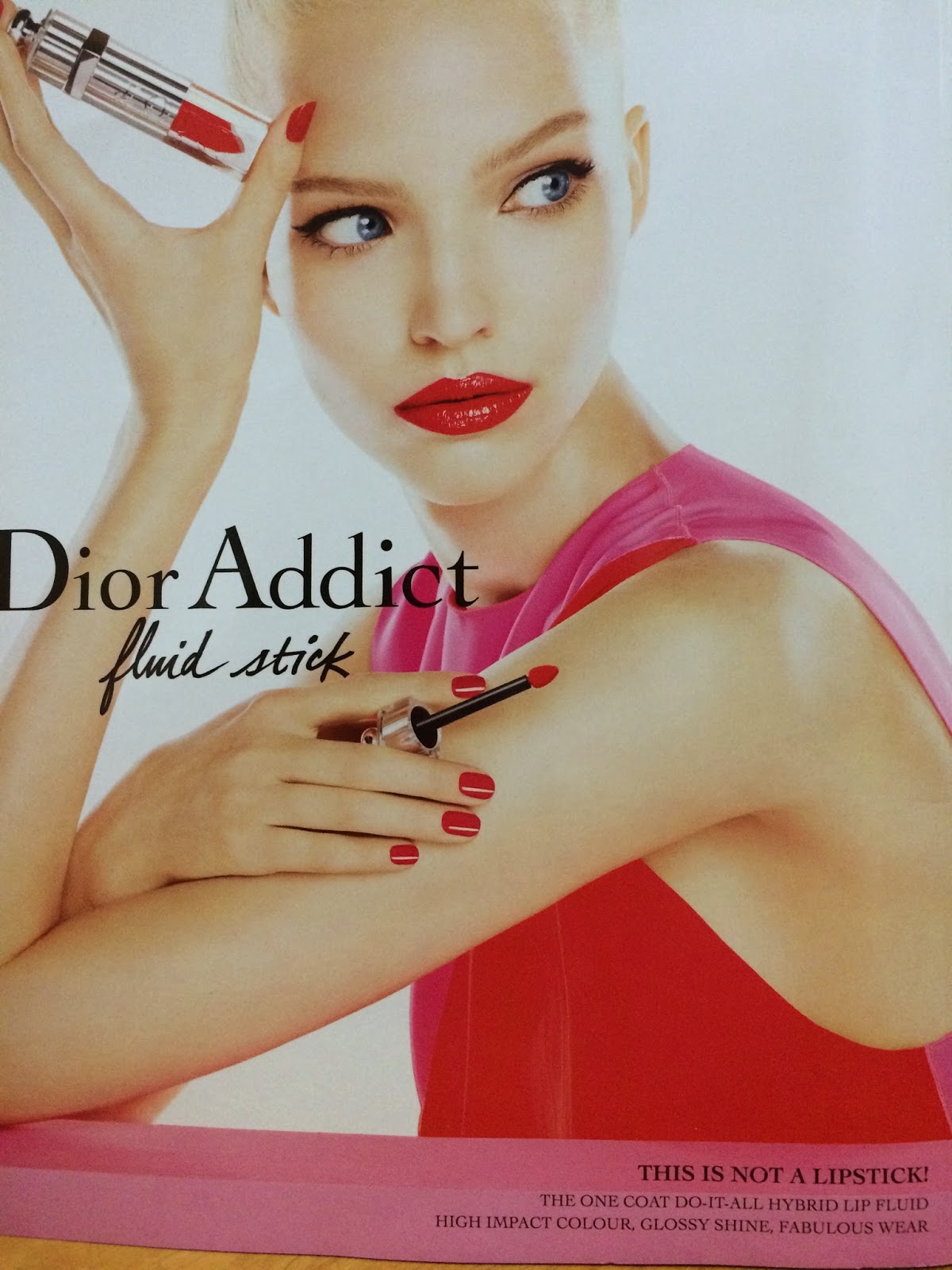
Title: Dior Addict Fluid Stick

Sponsor: Dior

            This ad by Dior was taken from the back cover of CLEO magazine May 2014 issue. The ad is targeted towards females, particularly adults aged 21 to 50. The product of the ad is a “hybrid” of lip gloss and lip stick which goes by the name Fluid Stick.  The ad focuses on introducing the new product and its’ benefits to readers, at the same time convinces the readers that the product has great prestige. The ad uses the headline “ This is not a lipstick1”  to arouse readers’ curiosity and thus leading them to read on. Readers’ will then move on to the subheadline : “The one coat do-it-all hybrid lip fluid, high impact color, glossy shine, fabulous wear.” The subheadline further explains the benefits of the product, which is that the fluid stick is a convenient cosmetic as it is a combination of a lip balm, lip gloss and lipstick. Also, it has a variety of high impact colors too. The do-it-all lip fluid is brought out to overcome the problems that most women nowadays face, which is the convenience of using and bringing along less cosmetics.
            This ad uses the rational appeal to convince buyers, by emphasizing on the benefits that the fluid stick will bring about. Besides that, the feminine appeal is also used in this ad. This particular appeal is widely used in cosmetic and clothing brands ads, it aims at creating the impression of a perfect person. As for this ad by Dior, a beautiful model was shown using the Dior Addict Lip Fluid, the message is that the product will infuse the perfection or the stated qualities in whoever uses the lip fluid.
            Lastly, this ad uses a sophisticated and daring tone to deliver their message to the audience by focusing on the use of red color in the ad. That will create a memorable impression to the readers.


Signing Off : KoYin Lau 0308565


Saturday 6 September 2014

Reflection 1 (Classical Print Advertisement)

Week 2 

Post 3

Reflection


Bill Bernbach‘s copywriting is not mainly about selling and promoting the car. It brings out the information about the vehicle to the customer. He does not mainly focusing selling the car but he is telling the advantages about it. The headline that he created is linked to the picture of the vehicle, tiny in size and in black color with white background to bring out that the message about the vehicle was actually small. He used the concept of creative and bringing out the information in this advertisement. Compared to Julian Koeing, his advertisement is also about cars, but instead of telling the information, his style of copywriting was actually about promoting the cars, selling the cars to the customers. Julian Koeing advertisement is basely about selling the vehicles, and persuading the customers to buy the vehicle. Julian used a most creative and intelligent idea to bring out the advertisement. He used a fruit named as the title of the advertisement to attract the audiences to read the advertisement. In the other hand, the title that he created was not linked to the image, it left a lot of imagination space for the audiences. Julian Koeing, is a famed advertising copywriter who yet claimed himself just as “a writer of short sentences” and also regarded as one of the 20th century’s most innovative advertising writers. Compared to Bill Bernbach instead of telling how good quality is the vehicle, he is telling the audience more information about the vehicle.

Sign off by : Chloe Low Zhi Hui   0314910

Classical Print Advertisement 2

Week 2

post 2


Julian Koenig


Media: Internet print ad.
Ad Title: Lemon.
Headline: The headline of the ad is "Lemon" which made the ad look much more interesting and unique than any other ad as it is a car in the photo.
Body Copy: The body copy is rather lengthy and not very interesting because of the word lemon been used as describe for the poor quality cars. They are trying to tell the people that each and every car produced in VW goes through 3389 inspectors.
Slogan: The slogan, "We pluck the lemons, you get the plums" is interesting as it catches attention and simple.
Visuals: Not very interesting as it did not describe much about the headline as the main meaning of the ad is from the body copy itself and it is not very related to the visual.
Ad strategy: Julian Koenig's copyrighting focuses on promoting the services and inspection required for each car to go through in the all the stages of production to ensure the quality of the car is better than any other car and it requires less maintenance as in the body copy itself says that VW are get rejected even if there are surface scratches barely visible to the eye. The headline catches attention of readers or viewers to think whether this is an ad about a fruit or a car but the headline of the ad is not very much related to the car itself.
By : Lim Sze Young

Sign off by : Lim Sze Young  0319254


Classical Print Advertisement 1

Week 2

Post 1

Bill Bernbach


Source: http://designshack.net/articles/graphics/the-greatest-print-campaigns-of-all-time-volkswagen-think-small/

Media: Internet

Ad Title (Headline): Think small

Headline: Yes is interesting, the word is simple that caught people’s attention and curious about it and makes them to read the body copy.

Body copy: Yes is interesting, it is short and talks about the advantages of owning a small car that relates to the headline and the visual.

Slogan: The slogan “think small” it’s interesting, simple and short that is easy to remember.

Visuals: It’s interesting because it is creative that filled with white space with a small Beetle car. 


Ad strategy: Bill Bernbach’s copywriting approach do not promote the brand of the car, it focused on providing as much information about owning a small car to the customers. It does not persuade the customers to purchase the car. The strategy of the ad is the headline that talks about the advantages of using the small Beetle car compare to a big car. The simplicity of the headline and the visual that relates together to show the benefits of the car to the customers. It is because most of the car ads they advertise more on the luxury and status of the car as a selling point, but this ad they provide more information about the car rather than persuading customers to purchase the car.

By : Chin Yuli

Sign off by : Chin Yuli   0318573

Introduction

Week 1

Agency: ONE MAN ADVERTISING AGENCY

Group members :

  1. Chan Chi Rap   0306431
  2. Lim Sze Young  0319254
  3. Yap Shi Ying   0306133
  4. Lau Ko Yin   0308565
  5. Chin Yuli       0318573
  6. Low Zhi Hui    0314910

Purpose: We created this blog is for our assignment purposes due to the module (Creative Copywriting ADV60304). We will post our weekly work here as a platform of our submission.